How Low Dow 1968
This chart is updated every Saturday.
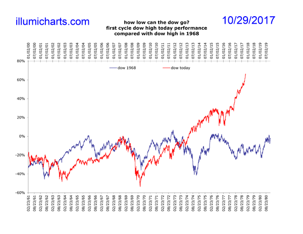
This chart shows a comparison between the Dow Jones Industrial Average from 1968 to 1980 and the Dow Jones Industrial Average today. This chart is very similar to the How Low Dow 1970s chart except that it is "zeroed" with an earlier Dow high. Instead of comparing the performance of the Dow from the highs of January of 1973 and October of 2007, it compares the performance of the Dow from the highs of December 1968. Why do this? Because in the 60's and 70's there were actually three Dow crashes, each larger than the previous one. How many will there be this time? See Dow Performance 1960 - 1984 for more information. A similar chart, zeroed in 1966 is also available.
The similarity between the stock market in the 70's and today is staggering. This has to do with the business cycle as it is creating by monetary inflation. These disloations in the market are done during the boom phase and must eventually be corrected.
The chart is produced by "zeroing" the highs for the Dow, one in December of 1968 and the other in October of 2007, and watching where the charts go percentage-wise from there.
Data for the Dow be found at Yahoo! Finance.

